Problem Space — Revolutionizing Digital Safety for Consumers
This project forms an interesting component in my portfolio. Not only was I leading a multi-stage redesign initiative, but the consumer product itself carried a major business impact for the company, playing a vital role in revenue growth and in the company's expansion target in a highly competitive consumer market.
The goal we set among the leadership team around the redesign launch was very aggressive: double-digit millions in revenue growth, a doubled consumer base, and major market share taken from much larger players.
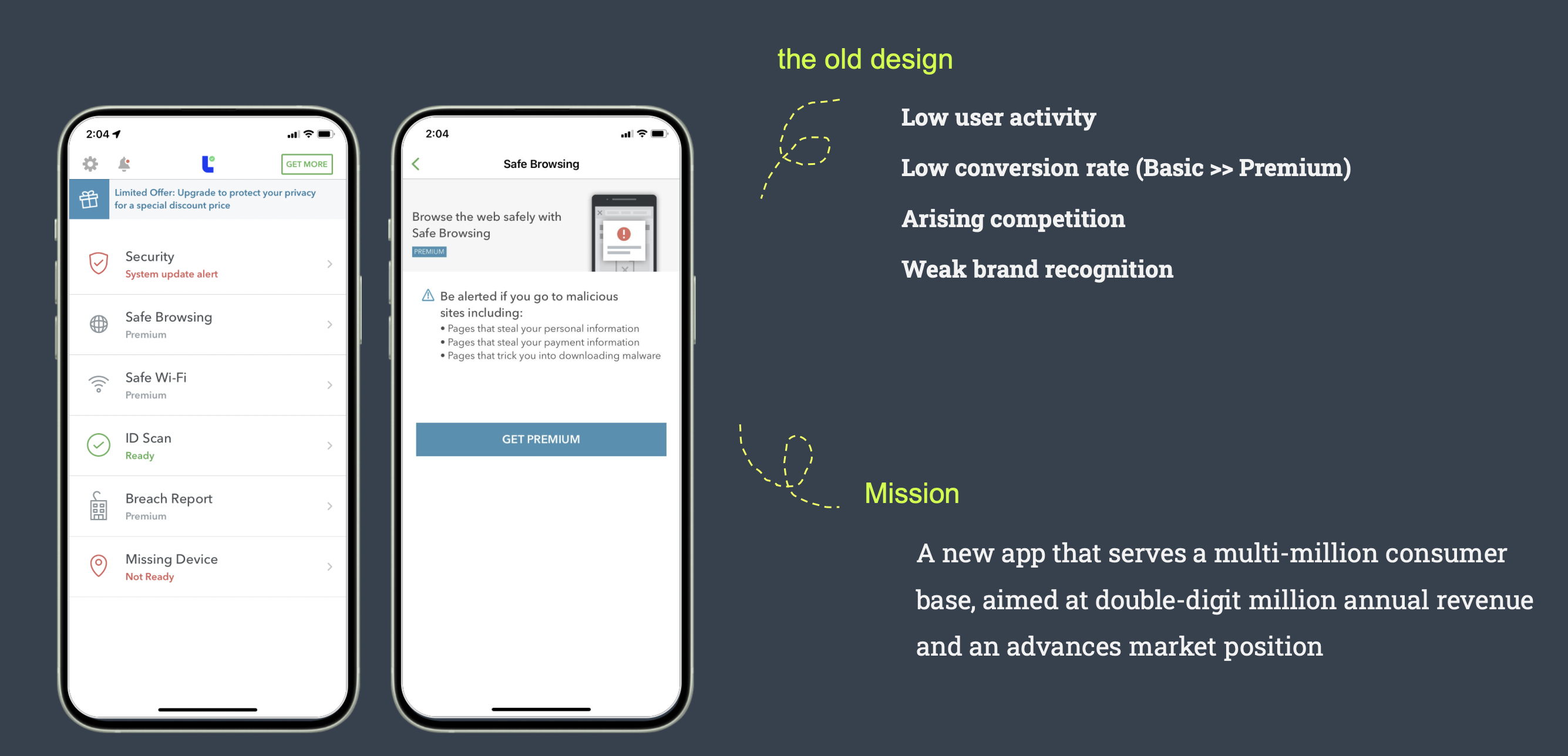
The uphill challenges we were facing on the other hand were severe, and all of them were backed by BI data and research findings:
Low Basic-to-Premium conversion — users either didn't know about the paid features or didn't see their value.
Intensifying competition — companies like Aura were entering the market with modern, better-perceived product solutions.
Weak brand recognition — the app had minimal visual identity, and the consumers we interviewed could not recognize the brand or feel connected to its image.
Our mission
Rebuilding a brand-new app from the ground up, serving a multi-million consumer base, aimed at double-digit millions in annual revenue and an advanced market position.
Project Outcome
As Director of Product Design & Research, I owned the strategy this project was built on, the standards of excellence it was held to, and the coaching of the design and research team.
I also held the function head's seat in the product discussions where the overall positioning and growth targets were set — the experience and the commercial model had to be delivered as a whole.
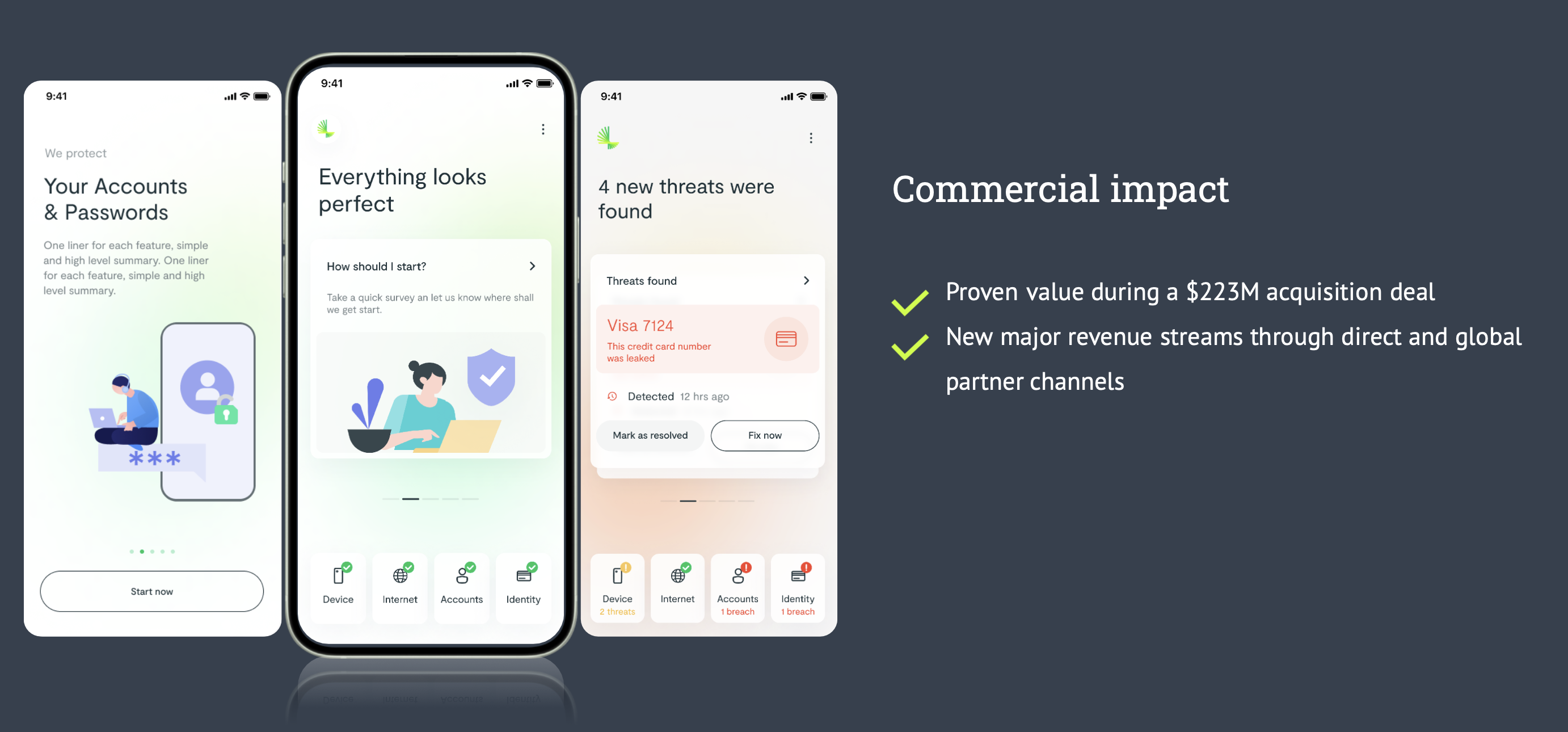
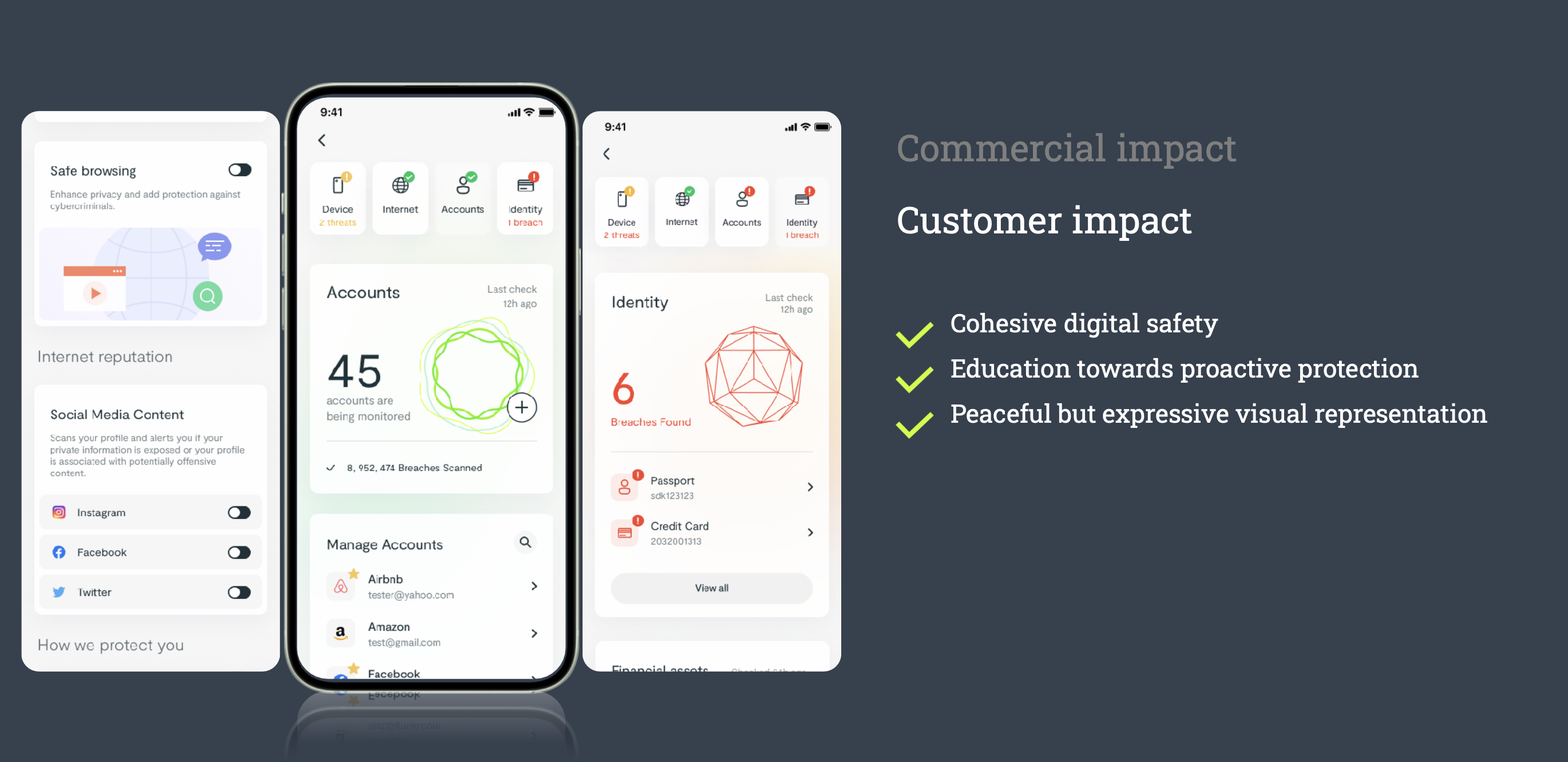
Over three milestones, close to a one-year span, my team — myself, a dedicated researcher, and two designers — successfully grew the product from a feature-driven security utility app into a value-driven digital safety product, with a cohesive digital safety offering, a rebuilt information architecture that scales with the level of protection a customer signs up for, and measurement built in from the first release.
On the business side, the most significant outcome we achieved was a successful acquisition, which best proved the value of the redesign. It also proved the case to our carrier partners and developed into new major revenue streams. On a larger perspective, the whole company recognized our success, and new product ideas began forming to drive synergy between the Enterprise and Consumer lines.
Research & Strategy
Current State Assessment
A redesign of this scale cannot start anywhere but with thorough research into the problems and opportunities in the problem space.
First things first, I worked closely with my research team on assessing the product's current state from four angles at once — competition landscape, target user needs, product evaluation, and business analysis.
Particularly on unmet user needs, the gap we identified was substantial. Anti-malware was no longer the standard: people asked for transactions protected end to end, identity protected from theft, spam stopped, browsing history kept private, and every device in the household covered. The definition of digital safety had been redrawn.
New Value Proposition & Target Segments
Setting the new direction came next. Coming from the research insights, I went through deliberate discussions with the Product Management leader to define a new value proposition. We eventually converged on this statement: making digital safety easy for everyone — with comprehensive protection and trustworthy advice that helps users make smart decisions.
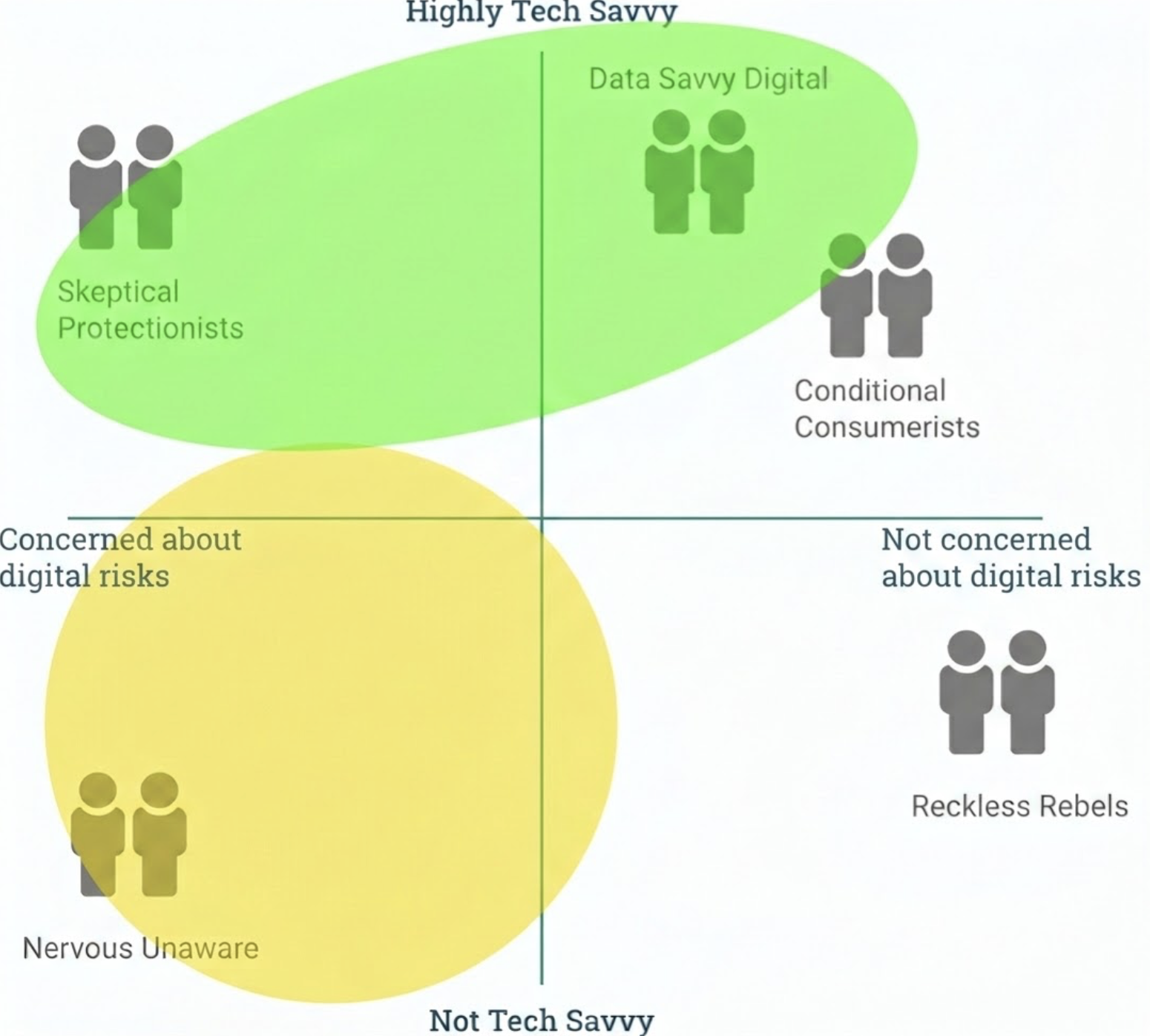
We also clarified the target segments. Instead of segmenting by demographic, we segmented by attitude towards digital risk — serious about digital protection versus less concerned — and by level of technology adoption. Our core theory was to acquire the tech-savvy group willing to pay for digital protection as the primary target, and the less tech-savvy but very serious group, also willing to pay, as the secondary target.
Design Mandates
From here, I guided my team to focus on developing design strategies, while I worked on my side to get senior leadership buy-in.
Switching from feature-driven positioning to value-driven positioning.
Moving users along the value chain with a seamless upgrade experience and confidence during decision-making.
Giving users good reasons to engage and stay, even on the "good day".
Educating users with proactive protection concepts, as opposed to traditional reactive protection.
Establishing a scalable IA that enables varying levels of protection and future product-led growth.
Empowering an optimization-driven and iterative mindset among the design team and among stakeholders.
Protects users from device and internet threats.
Reactive approach.
Holistic personal digital safety — identity, digital account, internet threats, breaches, and device protection.
Proactive approach. Optimization metrics and analytics applied from the get-go.
Concept & Validation
The Safety Concept
I called it pathfinding at this stage. Cybersecurity products often have an awkward property as consumer products: when they are working, nothing happens. Traditional security interfaces answer that by reporting threats caught, which proves value only on a bad day. I wanted to set a path that could advocate for proactive protection — where users decide their level of protection, have full control and full awareness of their security posture, and ultimately build a strong bond with the product.
So we were looking to build a new concept that could best convey the message: what you can see is how we protect you, from Day 1 to Day 90.
By design, each piece of display represents a layer of protection — device, internet, account, identity — that users can read and interact with on an ordinary day or a bad day. Our goal was to turn a black box into a single pane of glass and make the concept of protection tangible, which also makes user education the mechanism for building trust in the product.
Storyboard to Concept
During the early design journey, my team and I worked outward from storyboard to blueprint to concept. The storyboard step helped us materialize the relationship between the app and users from Day 1 to Day 90, and identify the drivers and needs that would advance product engagement. The blueprint allowed us to build up the skeleton through a lens of architecture. The concept work included both product feature mapping and presenting it in the most intuitive way — we deliberately designed for three types of contents, feature cards such as malware scan, information cards such as breach news, and education cards for how-tos, all of which can fit into a flat structure for easy browsing.
Our design rationale was that we could not simply ask users to trust the product — the product had to prove its value in front of them.
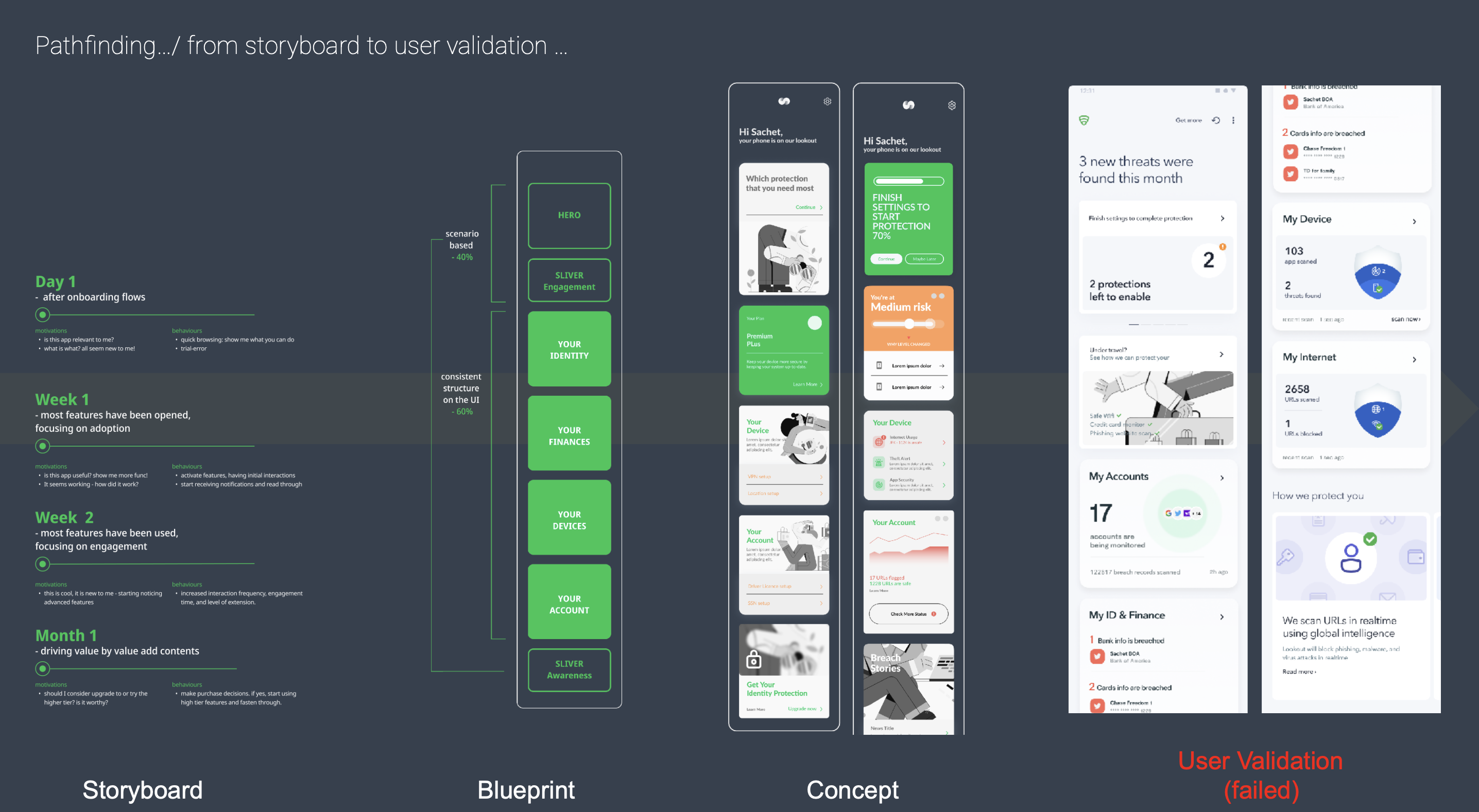
However, the first concept failed validation. Testing participants showed us something we had overlooked when adopting a purely flat UI structure that poured all content onto one screen: "I feel overwhelmed", "I can tell it is powerful but I am losing context". That failure was worth more than a pass would have been, because it revealed the principles we had been looking for.
Avoid embarrassing users when innovating.
Peace of mind means assurance at first sight.
Validated Direction
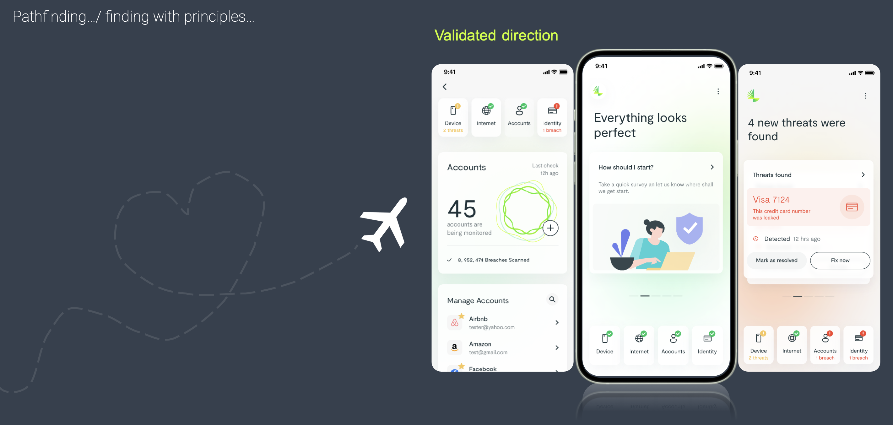
Applying the principles we had generated in the previous step, my team tested multiple alternatives for restructuring the features and contents, and landed on the tab structure for its predictability, scalability, and mental clarity — it balanced information accessibility with a strong sense of order, since each type of protection now had a stable location.
The tab structure also gave us a dedicated home screen to build the first-sight update on, without any competing information present. In the later design production stage we used the home area to communicate all sorts of important notes — threats, offers, actions. Framework thinking was one important mindset I have advised my team to always build on.
The updated direction was tested again, and this time the result validated it. We were ready to enter full-speed execution mode.
Production & Scale-up
1st milestone: MVP Baseline
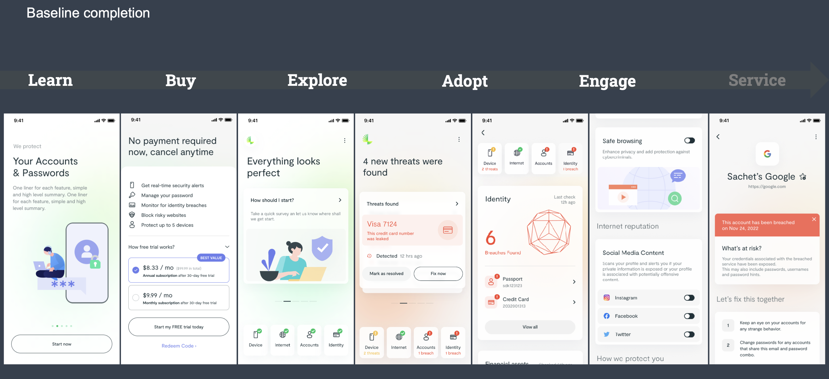
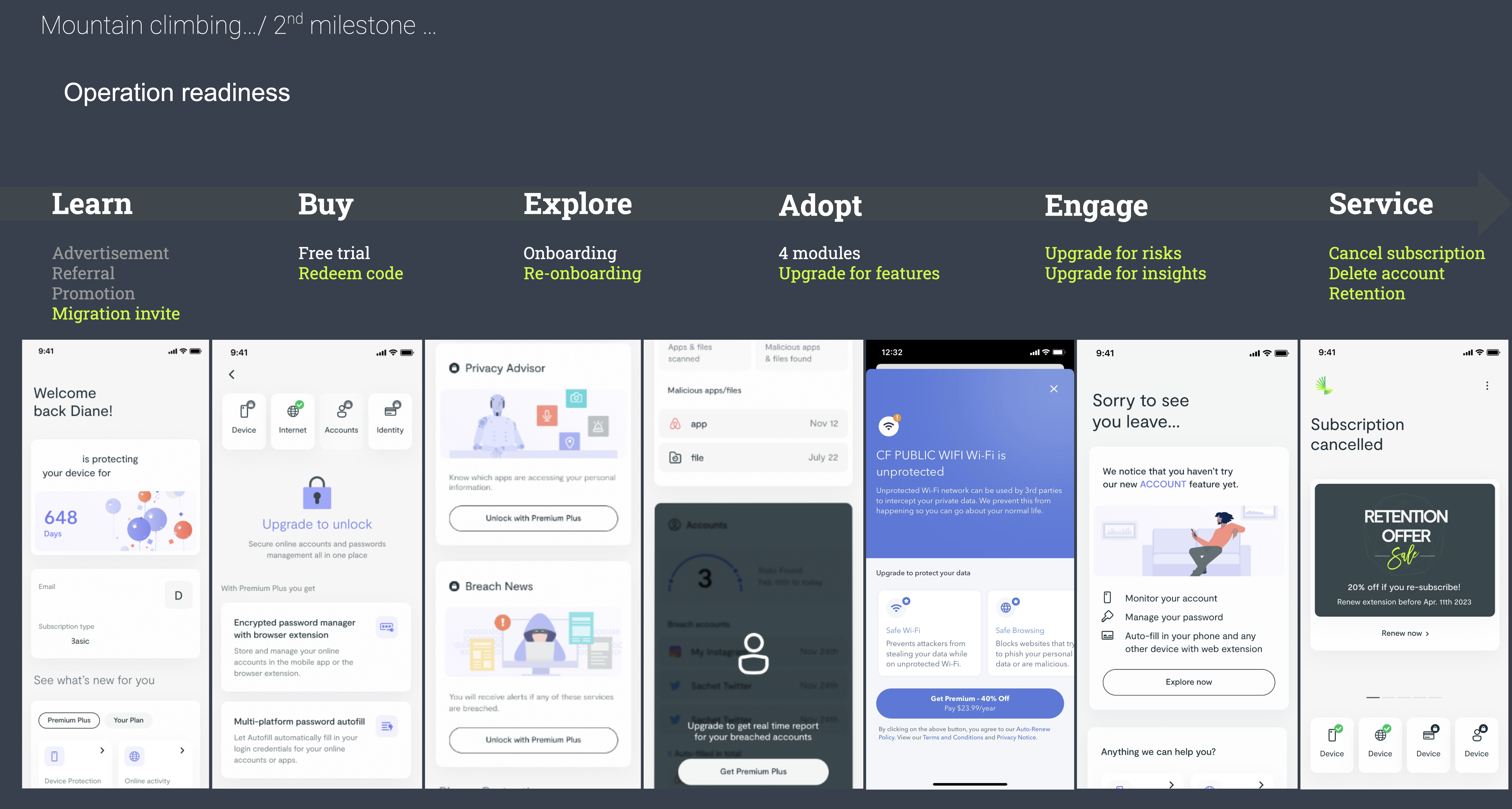
The first milestone covered the baseline journey for the MVP release — learn, buy, explore, adopt, engage, service — each guiding users through the end-to-end onboarding, daily usage, value realization, and retention stages.
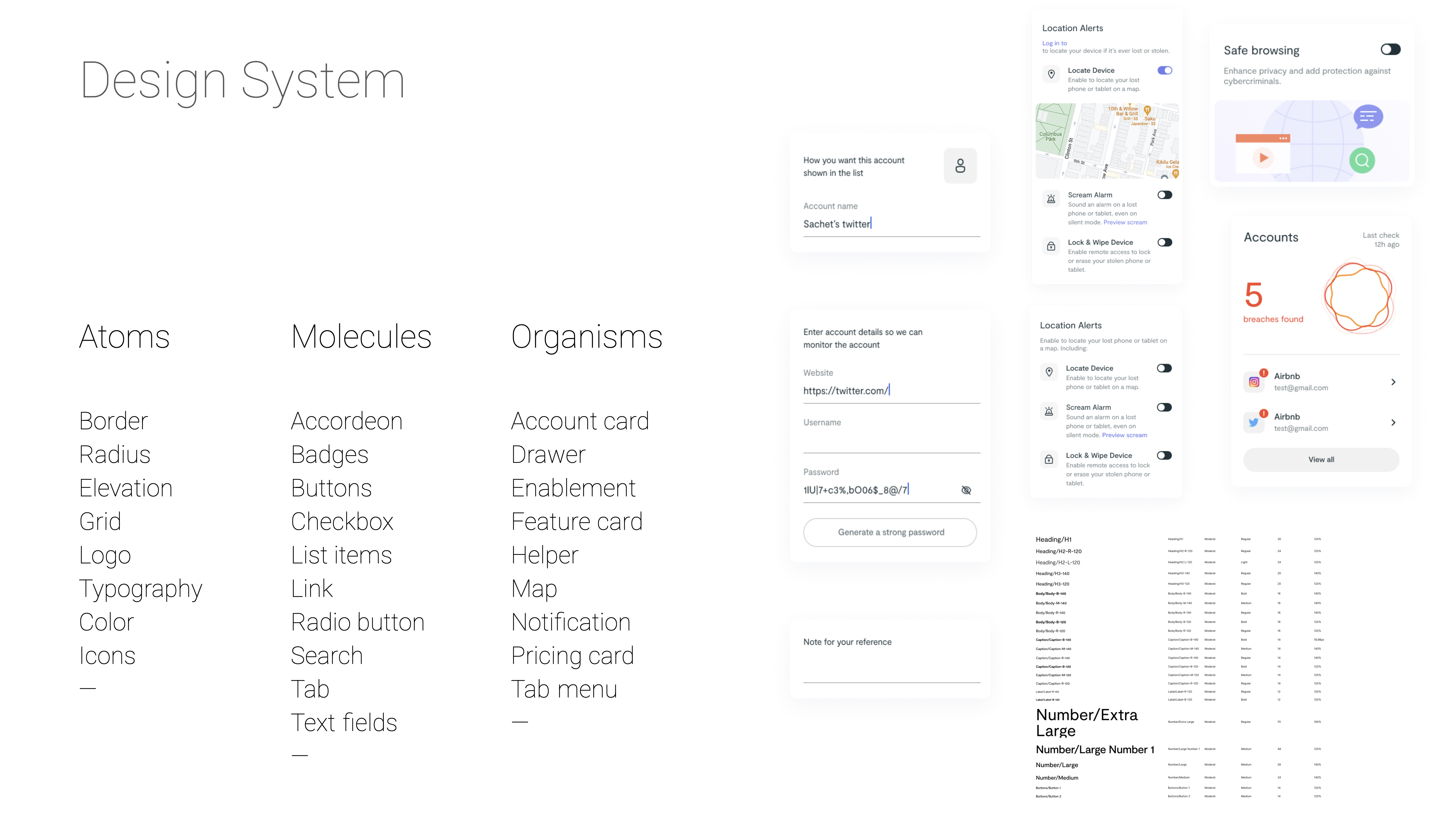
My focus at the execution stage was to set the quality bar high and guide my designers to apply product thinking while establishing the design foundation, through a design system, an interaction paradigm library, information and page architecture, and a visual language that manifests a new brand guideline — a joint effort between my department and the Marketing department.
Working at that span meant design rationale had to meet product thinking on equal terms:
A dynamic UX that adapts to the conversion channel and the user's pre-knowledge.
A UX framework deliberately optimized for product metrics and growth strategy.
Explanation of technology differentiators, for higher trust and better perceived value.
Adopting A/B testing when needed.
Design system
At the production stage, we needed to set up an environment where the entire design team could collaborate on production while we kept:
Quality floor — consistency, accessibility, brand guidelines, iOS adoption.
While we started with a mobile product, we could see other product form factors coming. The right investment was to prepare for a multi-product design system starting with the very first product form.
App Branding
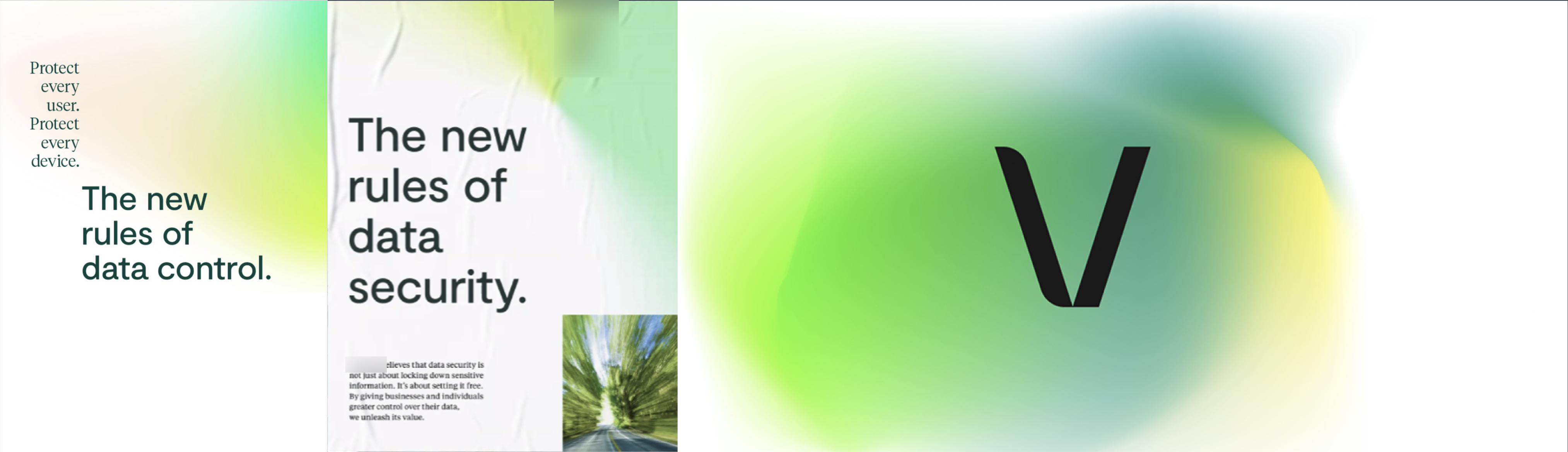
Another exciting design challenge was to develop a new visual language based on a new branding the company was evolving into, while keeping the unique DNA of this consumer product.
Absorbing the core brand idea — confident, empowered, in control, and liberated — I was looking to blend in a soft touch of friendly and trustworthy. A lot of digital security products promote the high-tech touch, where a colder theme and less expressive visuals are widely adopted. For our new positioning and target segments, it was important to deliver the newly positioned product with a strong presence of personal, fresh, delightful expression, while still keeping it minimal, bold, and direct.
Team & Process Scale-up
Scale-up arrived when the 1st milestone was wrapping up, and the discipline shifted from the design to the process.
I worked with my team to build up a consistent research and sprint planning cadence — research sprints allow us to constantly acquire feedback, reduce uncertainty, set up measurement, and iterate product decisions; design sprints allow us to assign resources effectively, govern design consistency, and maintain an efficient production pipeline for reliability and credibility internally.
2nd milestone: Operational Readiness
The second milestone was harder, because we aimed to extend our audience groups and support the different use cases various audiences might encounter. Existing free, premium, and premium-plus users, partner-sourced users, and new direct users all reached the same product through different doors — migration invites, redeem codes, free trials, auto updates, and re-onboarding were all operational flows we had to design before the second milestone could complete.
Each door changes the pre-context a user might carry before the first screen loads. A typical scenario is that a partner-sourced user might have fewer features coming from the partner offering, but we still want to give them full exposure and move them to a higher tier down the road.
I directed journey mapping per segment so each path could be optimized on its own terms, and had the team define a series of measurement targets for every stage, so we could chase the fine balance of optimizing for all the business metrics our design efforts touched — onboarding completion rate, user activation rate, return user activation rate, engagement rate, conversion rate, retention rate, LTV, and customer satisfaction score.
3rd milestone: Partnership Readiness
During the third milestone, the product line had attracted collaboration widely. We started to build a co-branding framework alongside it, so partner channels could launch on the same foundation instead of forking into a second design track. It was an indicator that our product had been growing into maturity.
Business Impact
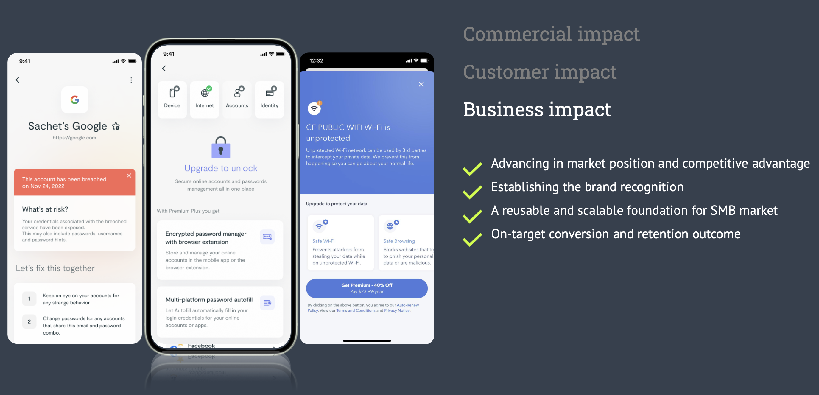
From the very beginning of the redesign, I partnered with the Product leadership team to define the product metrics, and empowered designers to work with autonomy to meet the targets. We had explicit targets for the initial launch — 90-day retention above 90%, and 45-day conversion above 10% — which provided clear guidance for designers to optimize the applicable design solutions.
Another impact worth mentioning is that this new app was designed on such a reusable and scalable foundation that it, along with its design artifacts, paved a solid path for the company to explore the adjacent Small Business market.
Destination: Acquisition
The final chapter of the project was quite unusual as well — it ended with a successful acquisition. The optimum product experience from the new design, and its massive potential, were among the leading factors that brought the company this outcome.
What I Carry Forward
Beyond what the product achieved, three things stayed with me.
Strategy as mandates
Strategy has to be written as mandates, not as a feature list. I learned this while abstracting the new value proposition into the path that would actually get us to the outcome. A feature list is spent the first time engineering pushes back on any one item in it — but "give users good reasons to engage and stay, even on the good day" survived every round of scoping, and it was still directing decisions three milestones later. I write strategy as mandates now: broad enough to hold several routes to the outcome, specific enough that any design can be judged against them.
Scaling as a leadership act
Scaling an operation is a leadership act, not a reaction to headcount. By the second milestone the work spanned research, design, engineering, and Marketing, and everyone needed to be able to build on each other's work to produce one product. Creating a highly collaborative and productive pipeline is a leadership tactic, not an administrative one — a design system with a dedicated owner, a research and sprint cadence, a brand guideline agreed jointly with Marketing. Quality and velocity stop being a trade-off once the environment carries both, and getting there is deliberate work.
A seat in business strategy
A design leader who is not in the business and product strategy discussions cannot deliver a value-driven product. The whole redesign turned on moving from feature-driven to value-driven — a decision about what the product is worth and to whom, made where growth targets, positioning, and tiers were set, not in a design review. That seat is why the UI foundation was built to express product tiers — so the tiers could be sold rather than explained, and the UX strategy evolved with the business decisions instead of after them. Holding the function head's seat in those discussions is what let the experience and the commercial model be authored as one thing. I have stopped treating business strategy as someone else's conversation.
It was a project with sweat and tears, and it brought the team together.